Legacy Forum: Preserving Nearly 20 Years of Community History - A Time Capsule of Discussions, Memories, and Shared Experiences.

RoboSavvy logo/banner

Anything that doesn't fit our other forums goes here.
8 postsPage 1 of 1
8 postsPage 1 of 1

What do you think of the new logo/banner?

Like it!
6
50%
Hate it!
6
50%
 
Total votes : 12

RoboSavvy logo/banner

Post by Layton » Sat Jul 12, 2008 11:39 pm

Post by Layton
Sat Jul 12, 2008 11:39 pm

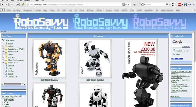
Hey, I took a little time to throw together this logo/banner for your site, using the existing size and background color as a template. I hope you like it. If you want to use it, no credit is required.

Image

Image

Image

perhaps it should read RoboSavvy.com?

and a preview with alternate color schemes:
Image
Hey, I took a little time to throw together this logo/banner for your site, using the existing size and background color as a template. I hope you like it. If you want to use it, no credit is required.

Image

Image

Image

perhaps it should read RoboSavvy.com?

and a preview with alternate color schemes:
Image
Last edited by Layton on Sun Jul 13, 2008 6:26 pm, edited 3 times in total.
Layton
Robot Builder
Robot Builder
User avatar
Posts: 18
Joined: Fri Jul 04, 2008 7:29 pm

Post by srobot » Sun Jul 13, 2008 5:09 am

Post by srobot
Sun Jul 13, 2008 5:09 am

Very cool!

I'm no designer, but if you want to, you may want to try a few logos with a humanoid robot like in the current RoboSavvy logo. That way people will know this site is about humanoid robots!

--Scotty
Very cool!

I'm no designer, but if you want to, you may want to try a few logos with a humanoid robot like in the current RoboSavvy logo. That way people will know this site is about humanoid robots!

--Scotty
Dell Latitude D520, Windows XP, 4 GB RAM, 80 GB HDD, Intel Core 2 Duo. The power that's needed!

RIBO Labs, Springing Robotic Development to a New Level
srobot
Savvy Roboteer
Savvy Roboteer
User avatar
Posts: 401
Joined: Sun Dec 10, 2006 1:00 am
Location: Deep in robot parts

Post by Layton » Sun Jul 13, 2008 6:33 pm

Post by Layton
Sun Jul 13, 2008 6:33 pm

srobot wrote:Very cool!

I'm no designer, but if you want to, you may want to try a few logos with a humanoid robot like in the current RoboSavvy logo. That way people will know this site is about humanoid robots!

--Scotty


thanks for the reply, I appreciate your feedback. The idea behind this is to keep it simple, clean and above all easy to read to make it accessible to the most people possible. By including a photo of an actual humanoid, there's some issues.

1. Unless you include all robots, some robots will be under-represented and others will be over-represented in the logo. I'm assuming the ppl in charge don't want to play favorites.

2. Copyright issues.

3. When new robots come out the logo starts to look old.

Hopefully the robot that is made up of the R serves as a logo and informs the uninitiated viewer what the site is about. I was going for something that wouldn't disturb the reader's eye from the name of the site, while at the same time creating a kind of universal iconic image of a robot that people can understand. The "R" robot should be iconic enough that if it was printed on a shirt people would instantly know that it's the Robosavvy robot.

I know it may be too "cute" for some people but I think it is more welcoming than the KHR's servo head. If you don't like it, please leave a comment too instead of just using the poll. Maybe the site doesn't need a new logo/banner but as I am a new user I felt the current one (and the banner that pops up while visiting the store) look a bit dated.
Layton
Robot Builder
Robot Builder
User avatar
Posts: 18
Joined: Fri Jul 04, 2008 7:29 pm

Post by srobot » Mon Jul 14, 2008 3:54 am

Post by srobot
Mon Jul 14, 2008 3:54 am

Layton wrote:
srobot wrote:Very cool!

I'm no designer, but if you want to, you may want to try a few logos with a humanoid robot like in the current RoboSavvy logo. That way people will know this site is about humanoid robots!

--Scotty


thanks for the reply, I appreciate your feedback. The idea behind this is to keep it simple, clean and above all easy to read to make it accessible to the most people possible. By including a photo of an actual humanoid, there's some issues.

1. Unless you include all robots, some robots will be under-represented and others will be over-represented in the logo. I'm assuming the ppl in charge don't want to play favorites.

2. Copyright issues.

3. When new robots come out the logo starts to look old.

Hopefully the robot that is made up of the R serves as a logo and informs the uninitiated viewer what the site is about. I was going for something that wouldn't disturb the reader's eye from the name of the site, while at the same time creating a kind of universal iconic image of a robot that people can understand. The "R" robot should be iconic enough that if it was printed on a shirt people would instantly know that it's the Robosavvy robot.

I know it may be too "cute" for some people but I think it is more welcoming than the KHR's servo head. If you don't like it, please leave a comment too instead of just using the poll. Maybe the site doesn't need a new logo/banner but as I am a new user I felt the current one (and the banner that pops up while visiting the store) look a bit dated.


Yeah, I understand what you are talking about making it "the RoboSavvy robot".

Maybe you could have the text "Humanoid Robot Online Community + Store"? Like I said, I not a designer or brand builder :lol:

Do you make logos and stuff as a business, or just for fun? If it's just for fun, you should sell this stuff! It is great! :D

For a new member, you've already put a lot into this forum!

Thanks,
--Scotty

BTW - If you have an online branding firm or something, link to it! It will not be marked as spam.
Dell Latitude D520, Windows XP, 4 GB RAM, 80 GB HDD, Intel Core 2 Duo. The power that's needed!

RIBO Labs, Springing Robotic Development to a New Level
srobot
Savvy Roboteer
Savvy Roboteer
User avatar
Posts: 401
Joined: Sun Dec 10, 2006 1:00 am
Location: Deep in robot parts

Post by Layton » Mon Jul 14, 2008 8:43 pm

Post by Layton
Mon Jul 14, 2008 8:43 pm

I just do it for fun. I took your suggestion and revised the robot a bit too, adding a little loopy eye animation.

Image
I just do it for fun. I took your suggestion and revised the robot a bit too, adding a little loopy eye animation.

Image
Layton
Robot Builder
Robot Builder
User avatar
Posts: 18
Joined: Fri Jul 04, 2008 7:29 pm

Post by Freeze » Tue Jul 15, 2008 6:29 am

Post by Freeze
Tue Jul 15, 2008 6:29 am

Good stuff!
I'm a designer by day and I'm liking it. The old skool bot on the top left, obviously humanoid, nicely integrated with the shiny "new" font. Upper-cased the R and S for clarity. Nice.

Only thing I might develop further is the "+Store". Seems added on... no pun intended. Maybe "Humanoid Robot Community & Online Store" ???
Freeze
Robot Builder
Robot Builder
Posts: 17
Joined: Wed Jul 09, 2008 12:03 am

Post by Layton » Sun Jul 20, 2008 2:34 am

Post by Layton
Sun Jul 20, 2008 2:34 am

Freeze wrote:Good stuff!
I'm a designer by day and I'm liking it. The old skool bot on the top left, obviously humanoid, nicely integrated with the shiny "new" font. Upper-cased the R and S for clarity. Nice.

Only thing I might develop further is the "+Store". Seems added on... no pun intended. Maybe "Humanoid Robot Community & Online Store" ???


hm, well yes if it would fit nicely I would have done that but I'd have to make the text smaller to get all the words in. I think separating the community from the store is also a good idea, even if it looks a bit tagged on.

Anyway, I decided not to bother anymore since I have not received any word from anyone running the site as to whether or not this would ever be considered for use, or if they are already considering it or not.
Layton
Robot Builder
Robot Builder
User avatar
Posts: 18
Joined: Fri Jul 04, 2008 7:29 pm

Post by srobot » Sun Jul 20, 2008 4:32 am

Post by srobot
Sun Jul 20, 2008 4:32 am

Layton wrote:
Freeze wrote:Good stuff!
I'm a designer by day and I'm liking it. The old skool bot on the top left, obviously humanoid, nicely integrated with the shiny "new" font. Upper-cased the R and S for clarity. Nice.

Only thing I might develop further is the "+Store". Seems added on... no pun intended. Maybe "Humanoid Robot Community & Online Store" ???


hm, well yes if it would fit nicely I would have done that but I'd have to make the text smaller to get all the words in. I think separating the community from the store is also a good idea, even if it looks a bit tagged on.

Anyway, I decided not to bother anymore since I have not received any word from anyone running the site as to whether or not this would ever be considered for use, or if they are already considering it or not.


Layton,

A new logo is being considered for RoboSavvy. Just note that a change will not happen without much thought, and may not happen at all.

Thanks,
--Scotty
Dell Latitude D520, Windows XP, 4 GB RAM, 80 GB HDD, Intel Core 2 Duo. The power that's needed!

RIBO Labs, Springing Robotic Development to a New Level
srobot
Savvy Roboteer
Savvy Roboteer
User avatar
Posts: 401
Joined: Sun Dec 10, 2006 1:00 am
Location: Deep in robot parts


8 postsPage 1 of 1
8 postsPage 1 of 1